.jpg) Waunakee Village parks benefit from Rotarians and their families volunteering each Spring. Rotary Plaza, located in front of the Village Hall. Meet at 9am at Village Hall
Waunakee Village parks benefit from Rotarians and their families volunteering each Spring. Rotary Plaza, located in front of the Village Hall. Meet at 9am at Village Hall
Service Above Self
We meet In Person
Thursdays at 12:00 PM
Rex's Innkeeper Restaurant
301 N Century Ave
Waunakee, WI 53597-1135
United States of America
Waunakee, WI 53597-1135
United States of America
Mailing Address:
Waunakee Rotary
P.O. Box 159
Waunakee, WI 53597
Email Address:
Waunakee Village parks benefit from Rotarians and their families volunteering each Spring. Rotary Plaza, located in front of the Village Hall. Meet at 9am at Village Hall.jpg) A matching grant from Rotary District 6250 enabled Waunakee Rotary to purchase and install an aeration system at Rotary Walk at the Village Pond park. The aerators will improve the pond’s water quality, reduce algae, and improve habitat for fish, birds, and other wildlife. The trail around the pond is a pleasant place to relax and enjoy a peaceful, natural setting in the middle of our village.Waunakee Village parks benefit from Rotarians and their families volunteering each Spring. Rotary Plaza, located in front of the Village Hall. Meet at 9am at Village HallA matching grant from Rotary District 6250 enabled Waunakee Rotary to purchase and install an aeration system at Rotary Walk at the Village Pond park. The aerators will improve the pond’s water quality, reduce algae, and improve habitat for fish, birds, and other wildlife. The trail around the pond is a pleasant place to relax and enjoy a peaceful, natural setting in the middle of our village.
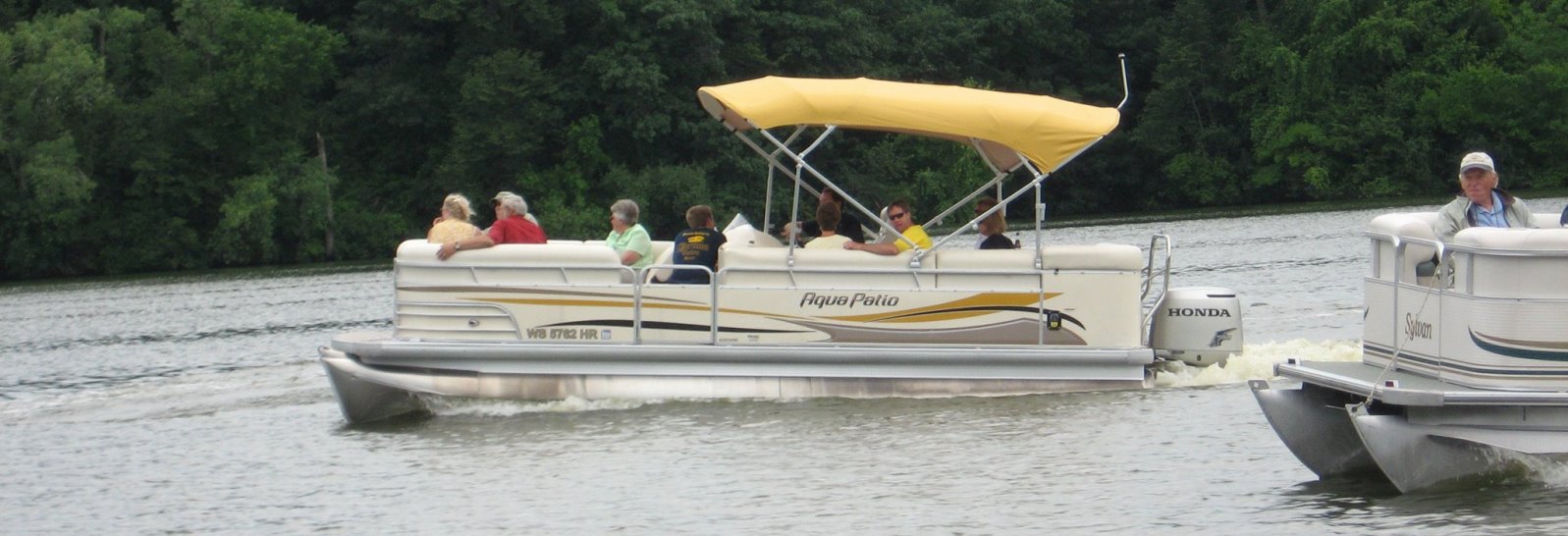
A matching grant from Rotary District 6250 enabled Waunakee Rotary to purchase and install an aeration system at Rotary Walk at the Village Pond park. The aerators will improve the pond’s water quality, reduce algae, and improve habitat for fish, birds, and other wildlife. The trail around the pond is a pleasant place to relax and enjoy a peaceful, natural setting in the middle of our village.Waunakee Village parks benefit from Rotarians and their families volunteering each Spring. Rotary Plaza, located in front of the Village Hall. Meet at 9am at Village HallA matching grant from Rotary District 6250 enabled Waunakee Rotary to purchase and install an aeration system at Rotary Walk at the Village Pond park. The aerators will improve the pond’s water quality, reduce algae, and improve habitat for fish, birds, and other wildlife. The trail around the pond is a pleasant place to relax and enjoy a peaceful, natural setting in the middle of our village.Waunakee Rotary is a group of community leaders who join together, exchange ideas and take action to improve the lives of others - in the Waunakee area and all over the world. We normally meet each week for lunch, and our meetings usually include guest speakers from all over the world. If you are interested in learning more, contact us at waunakeerotaryclub@gmail.com for information on how to attend a meeting as our guest.
Waunakee Village parks benefit from Rotarians and their families volunteering each Spring. Rotary Plaza, located in front of the Village Hall. Meet at 9am at Village Hall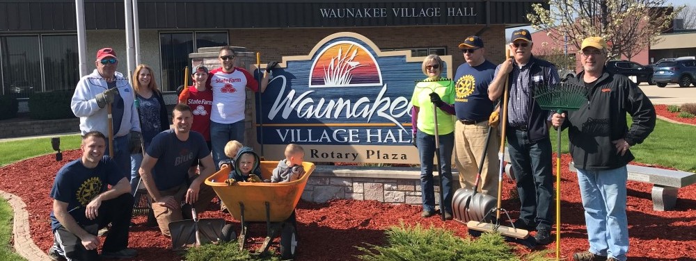
Civic Pride
Fellowship

Senior Picnic
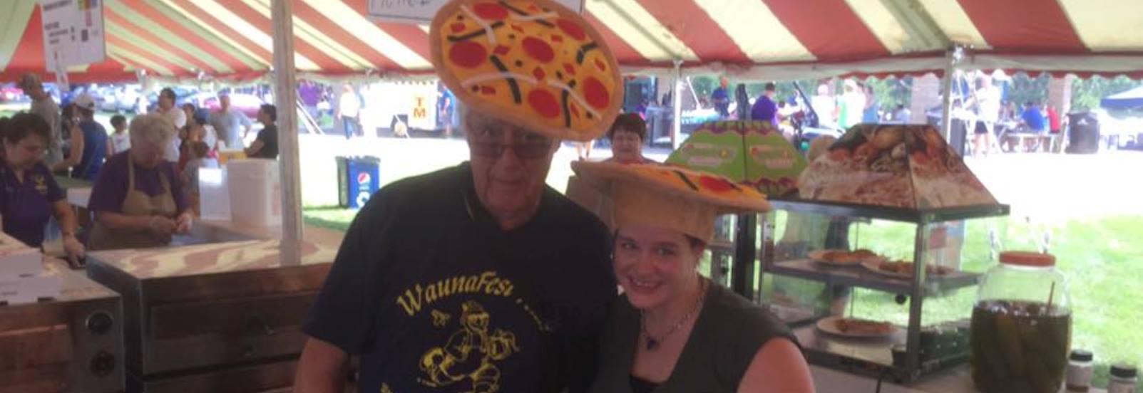
Waunafest Volunteers
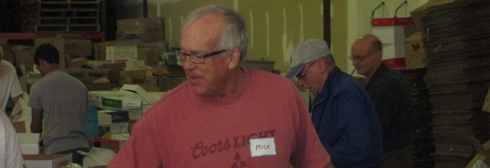
Food For Kidz

Leadership Team :)

International Projects
The Waunakee Rotary Foundation is a 501(c)3 tax-exempt organization and donations it receives may be deductible for tax purposes. Funds are used to support projects in our community and around the world.
Visit us on 


President
President Elect
Treasurer
Secretary
Director
Director
Director
Past President
Director
Public Relations/Social Media
Club Service Chair
The Rotary Foundation
DEI Chair
Community Service Chair
Environmental Service Chair